sweetgreen Home Screen Redesign
The purpose of this exercise was for me to showcase my approach and thought process to problem solving. Detailed design was not the objective of the exercise, although I was expected to deliver a concept.
My objective was to redesign Sweetgreen’s iOS App home screen to better serve returning customers. A substantial percentage of returning customers habitually order from a set of 3 items. Additionally, the more customers try new items, the greater their LTV (Lifetime value).
Max time: 2 hours

My Thought Process & Approach
These are the key goals that I wanted to accomplish:
Refine the interface to make it more usable as well as more functional
Redesign the home screen to better serve returning customers
Incorporate features that’ll entice new customers to order and returning customers to try new items
Given the short time of two hours, I took a quick approach of taking the current home screen and breaking it down to its fundamentals (think re-wireframing). This makes it easier for me to analyze each of the elements to what purpose they serve and how much it’s valued.
Overview & Notes
Click image to open in lightbox or right-click and “Open image in new tab” to see in full size.
Improvements to Existing Features
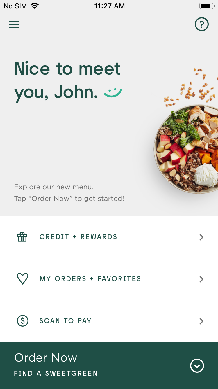
Before making additions or omissions, I wanted to see what can be improved upon with the existing elements. The Credit + Rewards and Order Now components were places where I could see functional improvements.
For the Credit + Rewards component, instead of a simple link, I turned it into an informational module that shows contextual info of status and rewards upfront. It gives returning customers a carrot-on-a-stick to chase for and also to inform new customers of this rewards program in a more visually-appealing way.
In the app’s current current state, the ordering menu is two screens deep, so I wanted to eliminate as many steps as possible. So for the Order Now component, I wanted to skip the Find Location screen if possible. When app location permissions are permitted, the last location used is automatically selected for returning customers. For new customers, the closest location is selected. This allows the customer to go straight into the menu. There is still the option to manually choose a location if the customer so chooses to.
Customer Retention and Growth
I changed the structure of the home screen from a fixed screen to a scrolling page format. The old home screen, while functional and utilitarian, didn't have much beyond that. The new scrolling page format is more scalable and flexible, and can show more meaningful and relatable content. It ultimately allowed me to implement features that would better serve customers, both returning and new.
Right when they open the app, customers are exposed to a plethora of sweetgreen’s offerings, instead of going 2-3 screens deep with the old app. With instant exposure of the food items and pictures, this will entice a new customer to make an order and returning customers to try new items. Also for returning customers: to make ordering their favorites or “the usual” easier, there's the Order Again module where they can simple tap an item to add to cart.
Refinements
The biggest problem I identified when using the app was navigating. A lot of closing screens and back-and-forth has to be done to reach certain parts of the app. For example, if i’m on the menu screen and I wanted to see my rewards and credits, I have to tap the back arrow button which takes me back to the Locations screen, then tap the close button to get back to the home, and then I’m finally able to tap Credits + Rewards link on the home screen. It’s a lot of hoops to jump through to just get back to the basic functions of the app.
To resolve this, I implemented a persistent toolbar. No matter where the user is in the app, they have instant access to essential and useful features. Pulling the card up to scan is one tap away. Going back to the home screen is only one step back from any point in the app. Ease of use leads to less frustration and more engagement with the app.